Evolution of The Mad Artist Logo

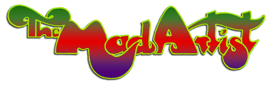
My primary idea was to give the book cover an instantly recognisable 1970s psychedelic feel, and as a reference I turned to Roger Dean’s illustrations for the album covers of the prog rock band Yes, and in particular the distinctive logo for the band’s name which became an early ’70s icon.
I attended a Yes concert in Bristol in 1973, at the zenith of their fame, which was unforgettably electrifying. In the goodie bag along with the programme there was a Yes logo sticker, and I put it in the centre of the dashboard of my VW Beetle and it became a permanent fixture there. Two years later, during my first acid trip, when Henry, Sean and I spent the night in the car trying to come down, I focussed on that sticker many times:
‘The logo, which had the word ‘Yes’ in a kind of floaty Möbius strip formation, in gradated sea blues, edged in red and black, appeared to glow in the car’s crepuscular interior, and every so often little blips of light would circulate around the border, reminding me I was not yet down from the acid.’
— The Mad Artist, Chapter Five.
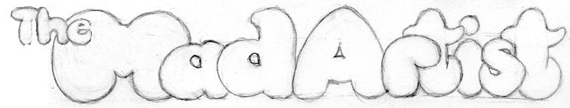
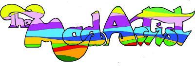
When it came to designing the cover, I contacted Dean Harkness, whose excellent covers for the Elastic Press and others were familiar to me. Dean instantly ‘got’ what I wanted to achieve and we liaised frequently as the design evolved through its various stages, from line drawings to the full rainbow colour finished product. It was a most satisfying creative symbiosis for both of us.
Visit Dean’s site for more examples of his work: Dean HarknessCopyright © Roger Keen. All Rights Reserved.